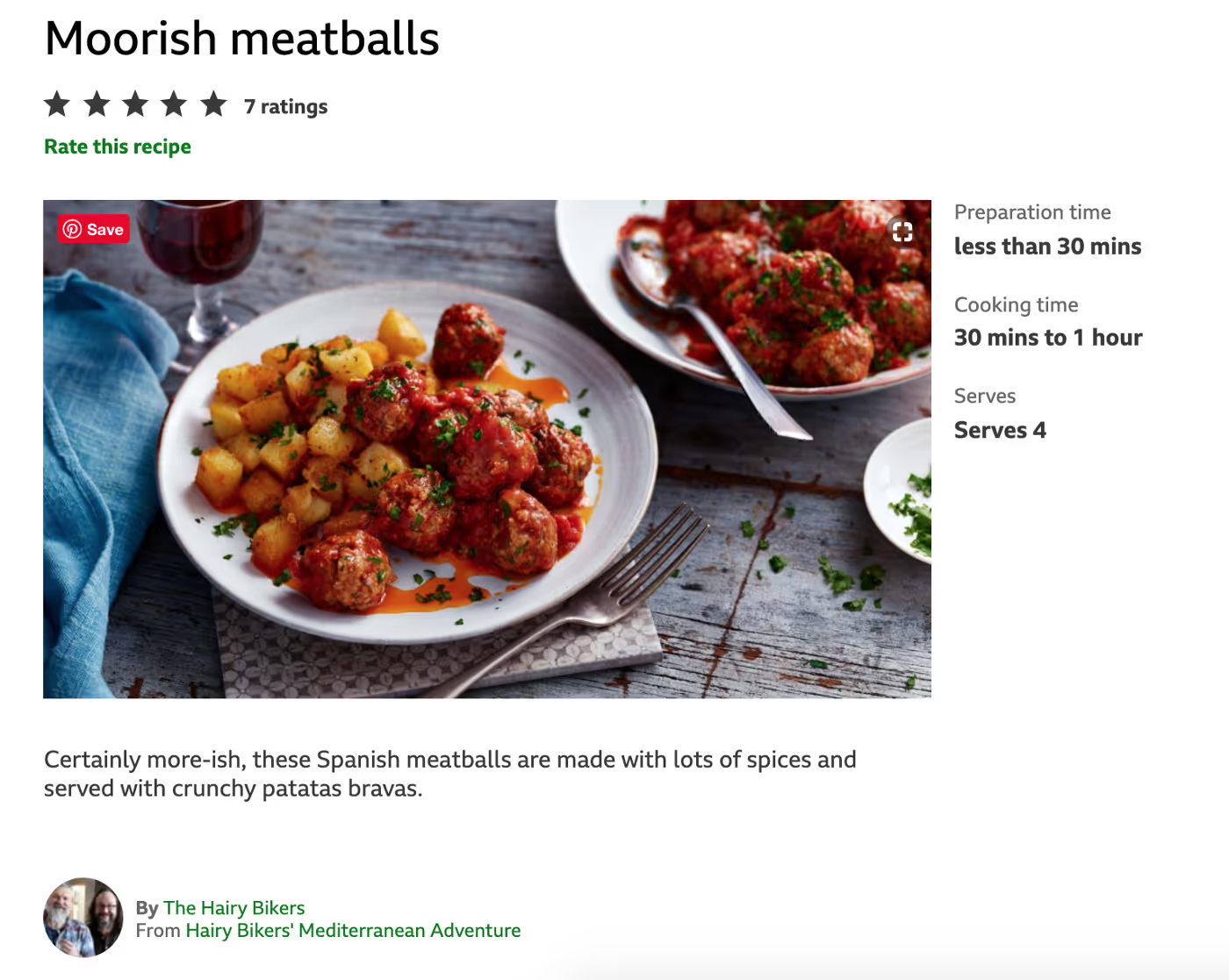
BBC Food is so much more than recipes. This delicious slice of The BBC’s elegant digital presence is a system of Chefs, Stories, Dishes, TV Episodes, Ingredients, Techniques, Diets, and of course, Recipes. And, for the most part, the connections between these concepts are supported by lovely contextual navigation: navigation that is powered by relevant content as opposed to a static list of persistent links.
The BBC has been basing their website design on domain models for over a decade (nod to Mike Atherton’s work) — years before I started practicing and teaching Object-Oriented UX. In OOUX, the design process focuses on objects, relationships, calls-to-action, and attributes (ORCA, if you need another acronym). In this look at BBC Food, we are going to focus on the objects and their relationships and how modeling can help pave the way for naturally intuitive navigation, exploring, and discovery.
(Btw, here’s a video supplement to this article if you just want to sit back and watch and listen.)
When an object’s detail page, say the “Recipe Detail”, doesn’t crosslink to other objects on the site, I call that an “isolated object.” A recipe that simply links to other “related recipes” doesn’t count. This just sends the user in a loop from one recipe to another, never giving them any new kinds of objects to branch or pivot off of.
BBC Food gives us a shining example of good contextual navigation. This started with defining the concepts within their system as objects. On most recipe sites, ingredients are just static content, locked up in a blob of text. But on BBC Food, ingredients on a recipe link to an ingredient detail page, which, incredibly, not only offers up a list of recipes that feature that ingredient but content on buying and preparation. Scroll further on that Paprika Detail Page, and you’ll be offered varieties of that ingredient and other related ingredients. Click on Cayenne, and head to another ingredient detail page, where you might click on Beef Burritos. From this recipe detail, you can head to a Chef detail page, which not only features recipes but all the “programmes” that the chef appears in. And the exploring can continue: from programme to episode to recipe to technique. As you can see, a user can flow through the site quite easily — it’s a great experience, but it’s not perfect. So, forgive me as the OOUX-purist emerges.
I am reading a story about whether or not bread is bad for me. The story links to recipe categories, such as “Gluten-Free Bread” but it doesn’t link to the Gluten-Free Diet Detail page!
Here’s another “one-way” connection. Let’s say I am making a Mango Pie and I am struggling with chopping all that mango. I notice that “mango” is clickable, so I follow that path to the Mango detail page. There I can find more mango recipes, a buying guide (awesome), and even a section for Preparation. But, no tips on chopping mango. I click the back button, return to my recipe, and continue the slippery struggle of mango chopping. Here’s the kicker, though. Go to the Techniques list. Do you see what I see? Yup. How to chop a mango.
Ok, one more friendly jab. Let’s say I am watching a Technique video on lemon zesting. Who is this delightful woman teaching me to not zest the “bitter, white part” of the lemon? In the description, “Add citrus zing to cakes, biscuits, and soufflés with Mary Berry.” I must know more about Mary Berry! But, I assume that there is nothing more to know about Mary Berry and I never discover Mary Berry’s robust detail page.
Wait, why would a user assume that there was nothing more to know about Mary Berry? If users know there is a list of Chefs, wouldn’t they just pop over to that list and find Mary Berry, sitting prettily at the top of the list? “Chefs” is in the main navigation, after all! Well, here’s the spicy rub. It’s because the user knows there is a list of chefs, each with a fancy detail page, that users might make the valid assumption that Mary Berry is NOT one of those chefs. Because if she were, wouldn’t there be a link?! If Mary Berry was anyone of consequence, here’s what I would expect to see:

With a dash of reverse-engineering, I re-created this system diagram of BBC Food, illustrating existing connections in gray and a few more that should exist in orange:

Most likely, these connections were built into the design team’s model, but for some reason or another they didn’t make it into production: scope, budget, timeline constraints — you name it. This work is hard. Talented back-end developers need to build a relational database that supports all of these connections. Content strategists need to set up a smart content-management system and governance that makes linking objects easy and straightforward for content creators. Visual designers need to lay out page templates so they work with all the potential permutations — like when a recipe has six related techniques and when it has zero. But none of this can ever happen if UX designers and Information Architects don’t start by building a model. So, that’s my call-to-action for you.
Here are a few steps to get you started.
- Figure out your objects by listening to the nouns your users and SMEs use over and over again.
- Draw the connections between those objects based on real-world, logical relationships. There! You have a diagram that illustrates your user’s mental model — and hopefully the business model, too.
- Design a detailed page template for each object.
- Now, design some badass contextual navigation to connect those detail pages, based on those real-world relationships.
Voila! You have contextual navigation. Your users will now be able to explore deeper, more naturally, and more meaningfully. Oh, and the SEO bots will, too.
Take a video tour of BBC FOOD with all of my thoughts.
UPDATE! Thank you @ahrenlehnert for pointing me here: “The BBC developed many ontologies and they’ve made them publicly available here: https://www.bbc.co.uk/ontologies. You’ll see the BBC Food ontology is there as well as the mappings in the ontology structure.”
Very cool! If you are actively working on these BBC ontologies, please reach out! I would love to chat with you on my podcast.
---
Originally published on Medium

