The best aspect of the Webflow CMS is that it saves us from having to do repetitive data entry. If you’re like me, you’re a builder, and as a builder, you like to actually build things. I don’t want to get stuck repetitively clicking and entering data all day and I bet you don’t either. If you want to change the tag “CMS” to “Content Management System,” then you want to change it once and have that change trickle down everywhere in your system.
And with the Webflow CMS, it can. But there are even more clever ways to use the CMS. In this article I’m going to talk about three ways you can make your Webflow CMS more strategic, more future-proofed, and more efficient, simply by thinking about whether something should be an option list or actually a collection in and of itself.
(For the Object-Oriented UX fans out there, this is a question of whether data should be an attribute on an object or an object itself.)
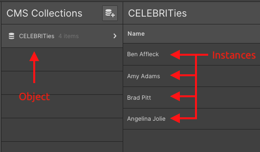
In this article I will use the convention of capitalizing CMS collections to denote them as the important objects in a system. See the below image of the CMS collection, CELEBRITIES, as an example with “Ben Affleck,” “Amy Adams,” etc. as instances of CELEBRITY.
In this second installment of my series on constructing an Object-Oriented CMS in Webflow, let’s look again at OOUX.com to uncover four good reasons to nuke your custom field and make it a bonafide collection. (Here’s the first article on strategizing the direction of your referenced collections)
REASON #1: Efficiency and Future Proofing
Ok, technically that’s two reasons. But creating efficiencies now goes so hand-in-hand with saving yourself work later that I had to mash these up. So, we will start with a 2-for-1.
In short, sometimes custom fields (metadata) can have enough combined complexity to justify turning them into a collection in and of themselves.
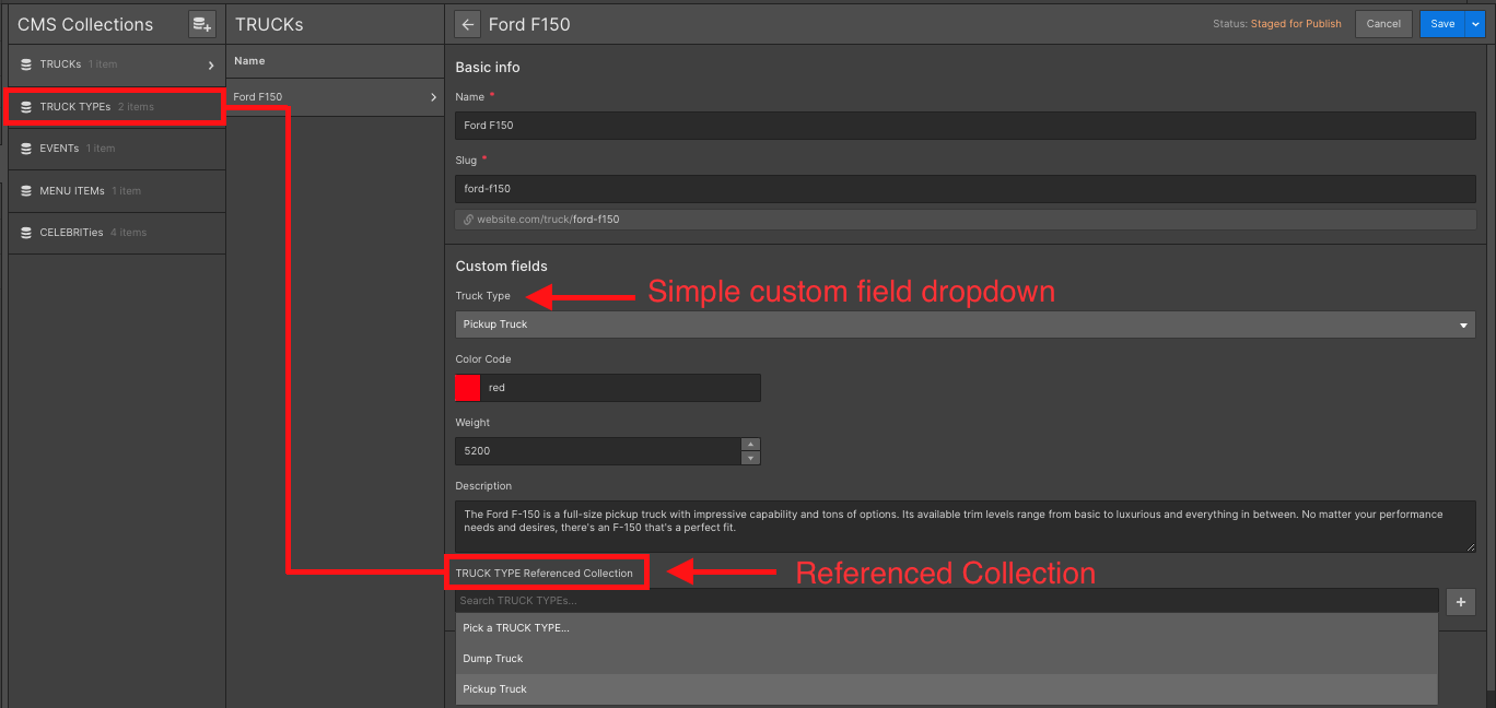
Think of a CMS collection of TRUCKS. Different TRUCK types have a name (Dump Truck, Pickup Truck, etc.), they have a color code, they have a weight, and they have a description.

You don’t want to have to fill these attributes out for every TRUCK instance in your system. Below is another screenshot showing the TRUCK TYPE dropdown converted into a referenced collection — these look almost identical but one gives you way more power!!!
If you read my first article on this subject, you may remember that the phase-1 version of OOUX.com consisted of just two Webflow CMS collections: STRATEGISTS and TESTIMONIALS. That is, people who have completed the OOUX Masterclass Certification (STRATEGISTS), and their TESTIMONIALS about the course.
Sophia V. Prater, my wife and the chief evangelist for Object-Oriented UX, is passionate about this subject, and as a result, she makes a lot of OOUX content. To add to that, our Certified OOUX STRATEGISTS also started producing articles, templates, OOUX Happy Hour presentations, and podcast interviews on the subject. We needed to showcase this amazing content on OOUX.com. Therefore, we further expanded our OOUX.com CMS to include the RESOURCE collection.
Now if you were paying attention in that last paragraph, you probably noticed that there are a lot of different types of RESOURCES: Podcast episodes , Articles, Templates, Events, Event Recordings, Videos…you get the idea.
It’s a safe assumption that RESOURCES will need to be organized by “type.” In order to do that I could make a custom field: add an option list for type, pop in the values listed above and call it a day.
BUT. There’s a BUT.
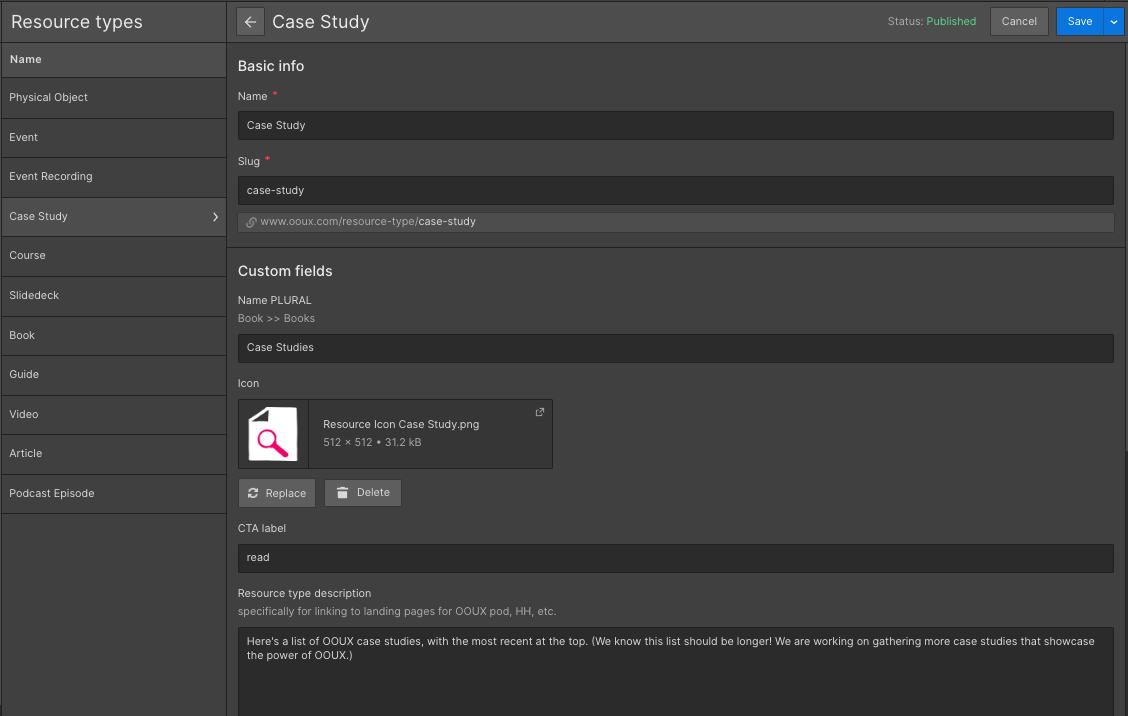
Sophia-the-designer wants each type of resource to have its own icon. She also wants to include some conditional logic that would align the call-to-action for each RESOURCE instance to the type of resource (e.g. “read” for article type, “listen” for podcast type, “download” for template, etc.).

We could add all of these attributes to the RESOURCE object as custom fields: resource type, resource icon, and resource CTA. But can you imagine the tedium of filling in this many custom fields for every instance of RESOURCE? There are over 130 RESOURCES on OOUX.com and more are created every month. With this inelegant setup, every time I add a new RESOURCE, I’d have to upload the correct icon and add the right CTA. And what would happen if I redesigned the icon for “Article”? I would have to upload that new icon to all 57-odd resources that are categorized as articles.
The solution here is simple. Move all of those custom fields into their own collection: RESOURCE TYPE.
When creating an option list in Webflow, ask yourself: will I ever want the values in this option list to have icons associated with them? Colors? Descriptions? Will they ever need their own structure?
Even if the answer is no right now, might you ever? And here we get into the future-proofing. Future-proofing is my favorite.
You can future proof your design by going ahead and moving it to its own collection.
Think about RESOURCE TYPE. Imagine I had not made it into a CMS collection and had instead opted to leave it as a drop down option field on the RESOURCE collection.
Two months down the line after 100+ resources have been added, Sophia now decides she wants an icon for each RESOURCE instance, based on its type. Uh-ohhhh.
This is now my life:
- Add a new CMS collection for RESOURCE TYPE to house these icons.
- Add a new referenced collection under RESOURCE to connect RESOURCES to RESOURCE TYPE.
- Go through all 100+ RESOURCE instances and re-tag each one with the correct RESOURCE TYPE, using the new referenced collection.
- Delete the legacy resource type option list.
By preemptively making RESOURCE TYPE a CMS collection, adding icons (or descriptions, or any other attributes) is fast and easy. All I have to do is add an image field to the RESOURCE type collection.
As we see here and we will continue to see in this article: even a modicum of systemic thinking can save you labor and conserve your sanity down the road.
REASON #2: When metadata gets around
Imagine a restaurant that specializes in menu items that cater to many different dietary needs such as vegan, dairy free, gluten free, nut-free, etc. This restaurant routinely serves at events that focus on one specialized diet or another.
If you are not familiar with OOUX methodology, one of the first steps is to go through a project brief and find all the nouns. We call this process “Noun Foraging.” There’s quite a bit of art and science to Noun Foraging, but in the simplest terms possible: find the nouns, group them, and narrow them down to determine the main objects that make up the users’ mental model, and thus, your system. These objects will become the CMS collections in Webflow.

Reading this short brief, you can see right away that we have two obvious objects already: MENU ITEMS and EVENTS. A keen eye may also have noticed “specialized diet” or “dietary need.” Most people would assume that diet should be a custom field (metadata) on the MENU ITEM. After all, a MENU ITEM can be vegan or dairy free.
But reading further, we can also see that the proprietors of our restaurant could host an EVENT that’s all about gluten-free cuisine. So dietary information also makes sense as a custom field on the EVENT object.
So, what do we do? Make two identical option lists on the MENU ITEM and EVENT collections? You could. If you want to set yourself up for making changes in two places.
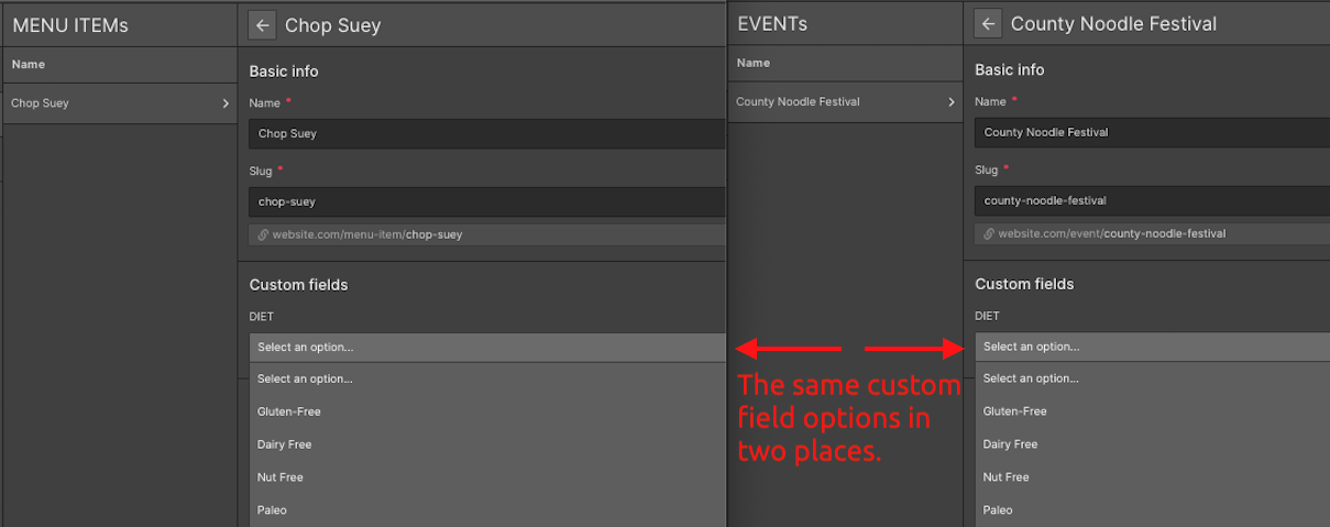
What happens when your client wants to add “soy free” as a new kind of diet down the road? Then, three days later, she wants to add “nut free” or “paleo.” You’ll need to add those values in two places — and that is precisely what we don’t want!
When a custom field can apply to multiple collections within the system, that is a good indication that you would be well-served by upgrading that field into its own collection.
Instead, if we just convert our diet option list into a CMS collection, it can be referenced under MENU ITEM and EVENT. A MENU ITEM is included in 0 to many DIETS. An EVENT centers around 0 to many DIETS. Now when your client wants to add “soy free” as an option in the DIET collection, it will show up as a new value on all collections where it is referenced.
And if we want to add icons and descriptions for each DIET later? Well, we are now set up to do that.
REASON #3: SEO Magic!!
As you probably know, the Webflow CMS automatically creates detail pages for each instance of each CMS collection. It does not deliver such a service for every value in an option list. Sometimes that’s fine. You don’t always need a detail page for every value of a given bit of metadata.
For example, on OOUX.com in our TESTIMONIALS collection, we have an option for type of TESTIMONIAL, i.e. is the TESTIMONIAL from an industry influencer? Is it about the OOUX Certification? Is it about the Self-Paced OOUX Masterclass?
We don’t have a reason to have pages automatically created for each of these types. We will always be strategically placing testimonials using collection lists on existing pages.
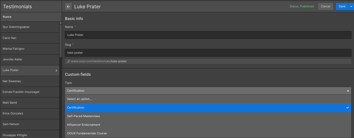
Ask yourself, would it be useful for a user to see all the objects tagged with this value in one place? For example, might a user on OOUX.com want to see all Podcast Episodes? Or all Event Recordings? It’s likely! And might a user search Google for “OOUX Articles?” Highly likely!
That is also why we added a CMS collection for TOPICS on OOUX.com, e.g. “Getting Started in OOUX,” or “OOUX Advanced Concepts.” If someone is searching for one of those themes or topics, Google can’t send users to a URL that doesn’t exist.
Turning an option list like topic on RESOURCES into its own TOPIC collection, gives us a template for our TOPIC instances. Now, we have a dedicated URL for all of our TOPICS.
Think about our earlier restaurant example with MENU ITEMS that can be tagged with dietary restrictions, which we converted into a CMS collection: DIET. Once DIET became a collection, Webflow automatically generated landing pages for every DIET in our collection: vegan, dairy free, paleo, etc. Now if someone is searching for “Atlanta vegan options,” our restaurant client has a high-value and relevant URL for just that.
That’s good for the user and it’s also good for SEO.
Did I mention Future Proofing?
Keep in mind that you don’t always need to do this. I’m absolutely not saying that you should stop using custom fields in your CMS collections! But ask yourself a few questions before you do.
Are the values in this option list all going to have any structure? Now or later?
Does your option list need to apply to multiple collections? Now or later?
Does each value in this option list need a detail page? Now or later?
Sometimes this kind of thinking can feel like looking for unknown unknowns. Object-Oriented UX helps with this. OOUX takes the fact that people interact with and see the world in terms of physical objects and applies it to system design. In an OOUXed system, the objects — the CMS collections — are the foundational bedrock the system is built on. As an OOUXer in Webflow, you’ll set up a future-proofed CMS before designing and building your screens. It’s a way of working that truly puts content and data first.
If you feel like you need help setting up your CMS for success, consider training in the art and science of OOUX!
Let me know if you have any questions!


